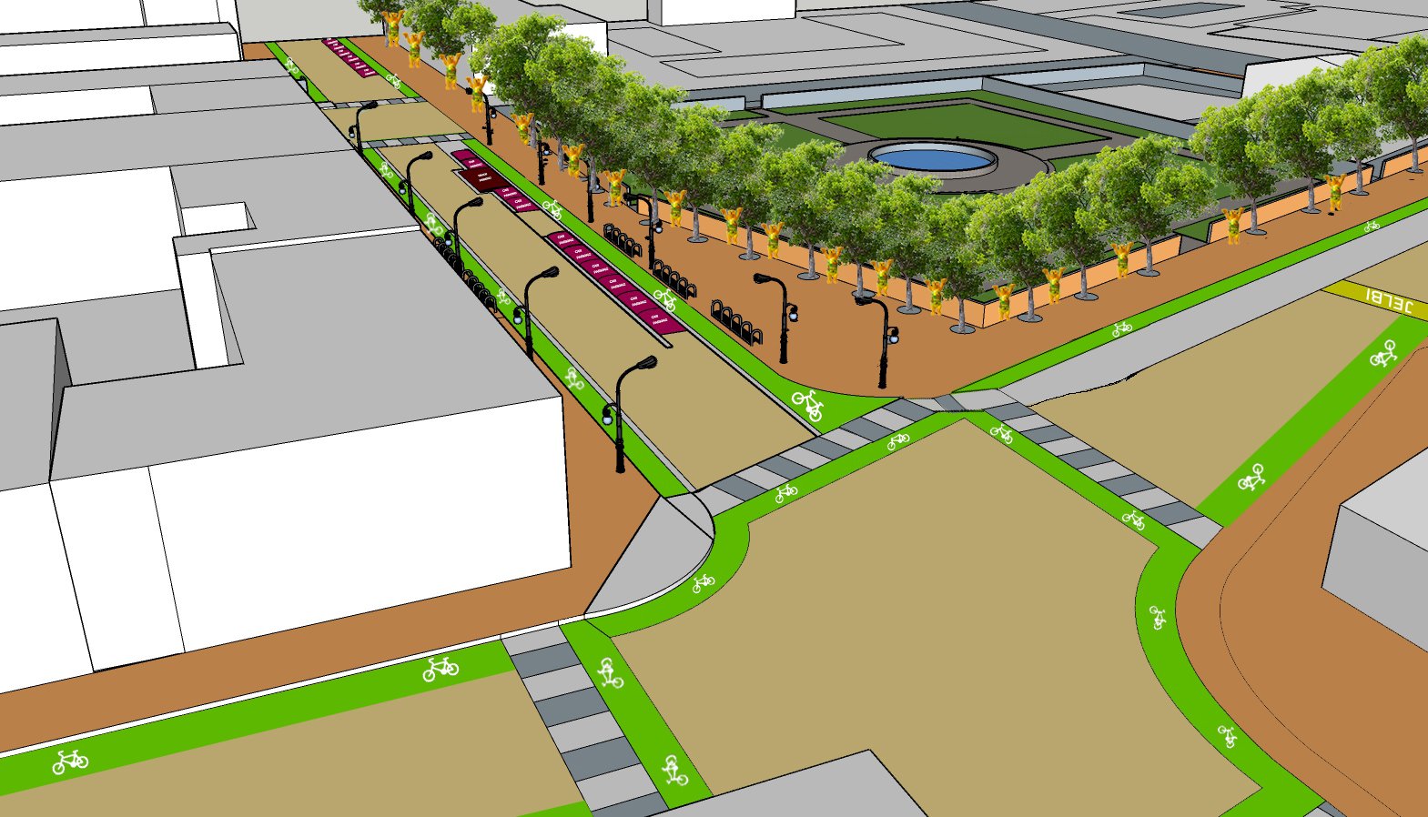
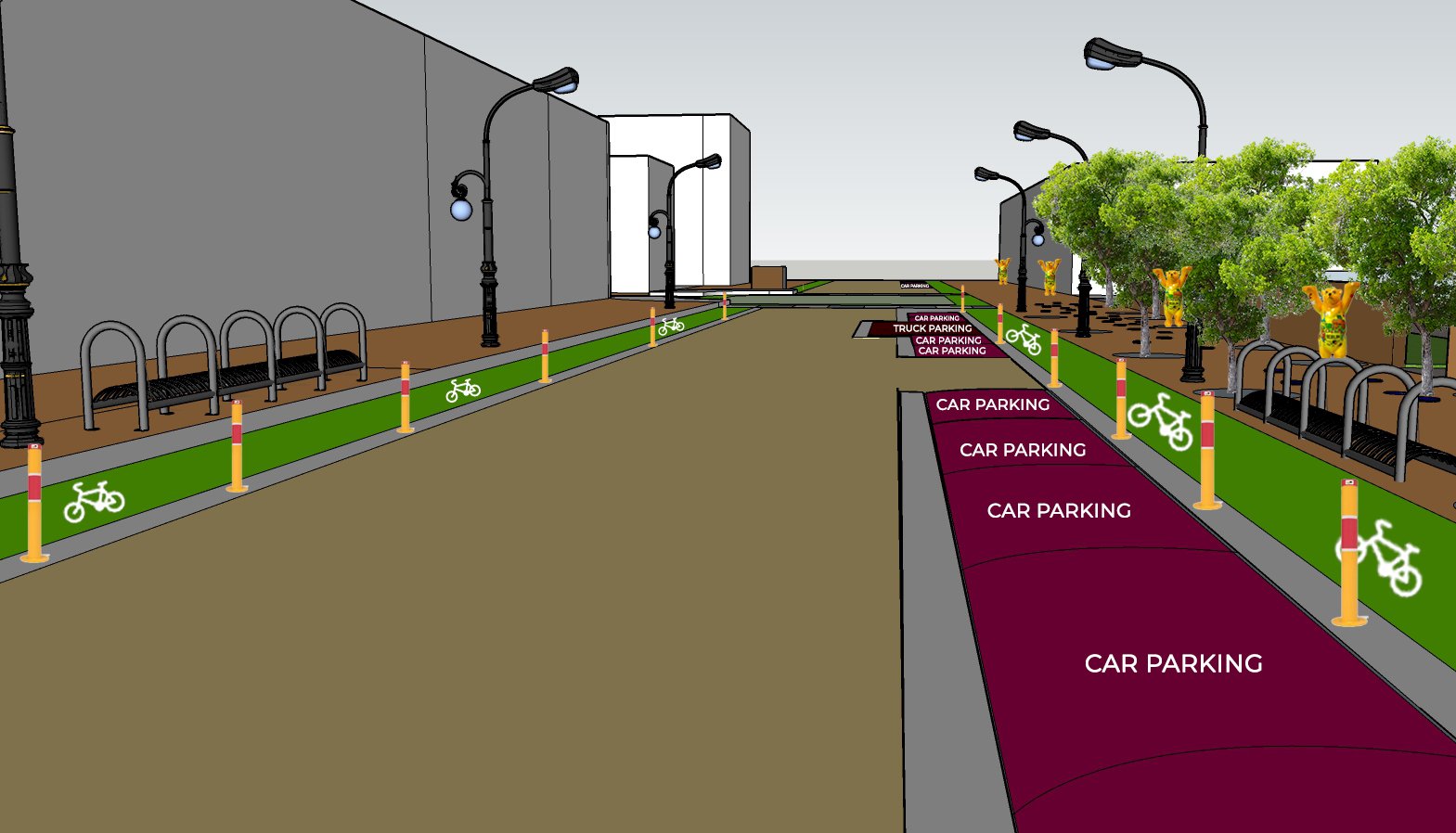
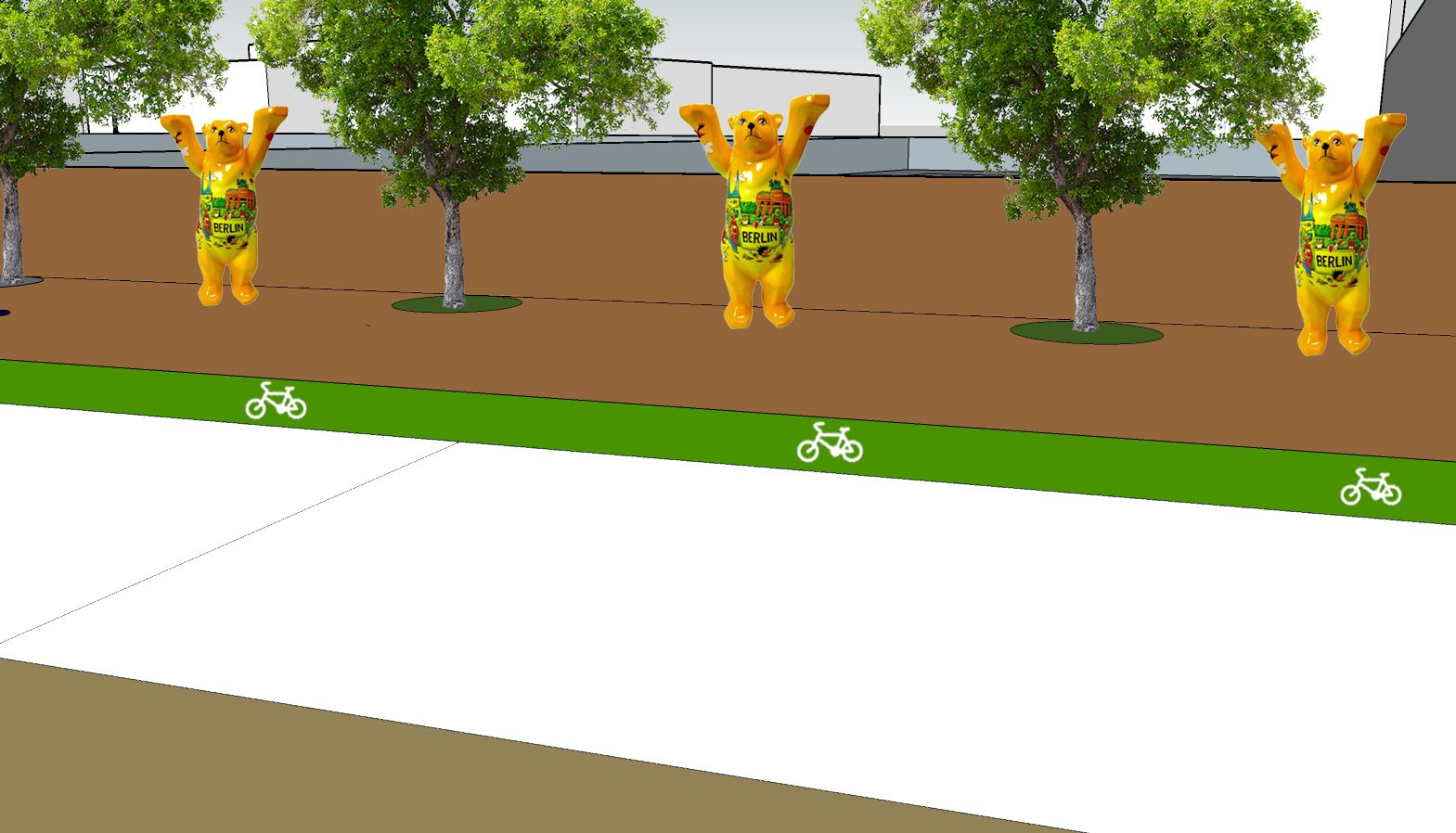
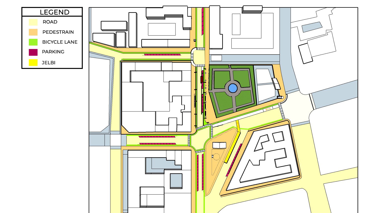
Since the site is near an immigration office, 3D bears are presented to demonstrate Berlin's uniqueness and welcoming each international immigrant. The Ivory Colour is proposed for the Pedestrian Area so that individuals may enjoy their walks more comfortably. The colour ivory enhances the walking experience and makes people feel more at ease. I suggested a green colour for the bicycle lane since it mimics environmentally friendly surroundings and since bicycling is the most convenient means of transport for a sustainable environment.
Adopting an off-white hue for the road to keep things simple so that the pedestrian and bicycle lanes attract more attention. Making the main street into an one-way is to offer walkers and bikers more area. The colour red for parking zones, with the justification that red is the only colour that pushes everyone to respect the laws and prevents them from going against it. In order to attract people the use of yellow colour is done to highlight Shared Mobility (Jelbi) as it previously appeared to be hidden and no one could easily locate it. Lastly, the marked crosswalk, the zebra crossing was incorporated to indicate crossing points and easing the flow of traffic.
![Pic for website[12]](https://unicorn-cdn.b-cdn.net/417c8bc3-a4a4-4de3-84fe-1786eb6512b8/-/crop/960x959/0,264/-/preview/pic-for-website[12].png)
